UX GUIDE · 5-STEP SYSTEM
AI can produce good UI screens, but most of the time it misses these 5 essential UX principles.
Use this workflow to find the problems, choose what to fix, and test the results.
BEFORE YOU START
This guide is for designers and people building an app with AI who already have a UI to review. Work through one check at a time. First understand the product, then identify problems, decide what to fix, and test those changes.
A broad request like “improve the UX” can push AI into changing layouts before it understands the problem. Each prompt gives it a focused job. Review its findings before letting it make changes.
Ask AI to summarize what the app does, who it is for, its main user goal, features, and screens. Check that summary before moving on. Provide what you already know about your users and correct mistaken assumptions.
Understand the product
✦
Paste into your AI coding tool
Inspect this product and explain how it works.
Summarize what it does, who it seems to be for, the main user goal, main features, main screens, and anything you are unsure about.
Label assumptions clearly. Do not change anything yet.
STEP 1: USER PROBLEMS
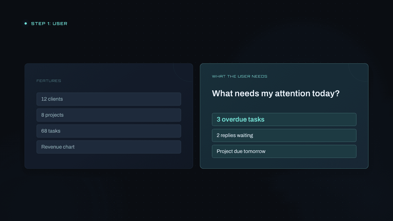
Is the app organized around the user’s goals? AI-generated dashboards often mirror features: clients, projects, tasks, and reports. But someone opening the app is trying to accomplish something.
A dashboard with 12 clients, 8 projects, 68 tasks, and a revenue chart may look complete without answering “What needs my attention today?” Three overdue tasks, two clients waiting for a reply, and a project due tomorrow give that user a place to start.
Review the primary user’s top three goals, what they should see first, confusing labels, and information presented before they need it. Ask where each issue happens, why it matters, and what would improve it.
Review the user’s needs
✦
Paste into your AI coding tool
Act as a UX reviewer. Look at this product from the main user’s perspective.
Identify the primary user, their top three goals, what should be most important, first-time confusion, anything unnecessary or shown too early, and features organized around the system instead of user goals.
For each issue: where it happens, the problem, why it matters, and a practical improvement. Do not redesign yet.
STEP 2: FLOW PROBLEMS
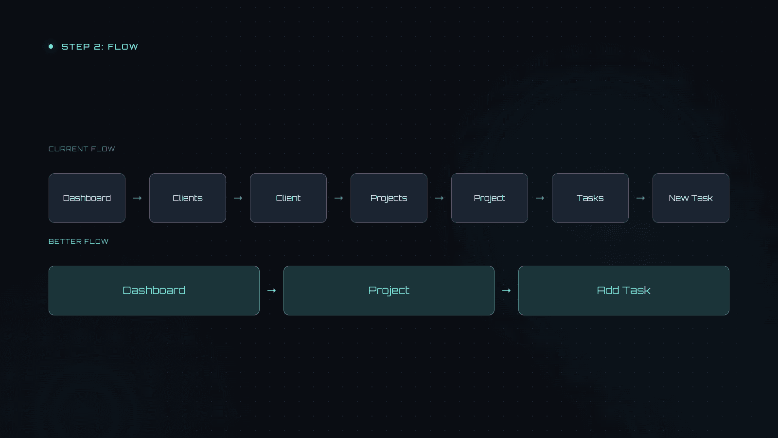
Can users reach their goal without unnecessary friction? A screen can look good on its own while the journey between screens is confusing. Map the three to five most important tasks from start to finish.
For example, creating a task might require Dashboard → Clients → Client → Projects → Project → Tasks → New Task. A clearer route could be Dashboard → Project → Add Task.
Keep steps that help users make necessary decisions. Simplify steps that exist only because of the app’s structure. Look for backtracking, unclear next actions, dead ends, information users must remember from another page, and missing confirmation when a task is complete.
Map and improve the flow
✦
Paste into your AI coding tool
Identify the three to five most important user tasks.
For each one, map the current path step by step. Find unnecessary steps, confusing decisions, unclear next actions, and dead ends.
Show the CURRENT FLOW and a simpler BETTER FLOW, then explain why it is easier. Do not add new features unless necessary.
STEP 3: STATES PROBLEMS
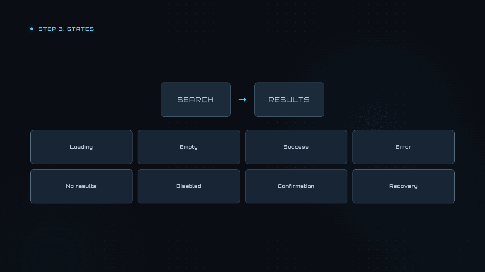
Does the interface explain what is happening and what to do next? Search may be loading, have no matches, or fail. Those situations need different feedback so users can understand the result.
Audit important actions such as saving, deleting, searching, uploading, and submitting forms. Include only the states that apply: loading, empty, success, error, validation, no results, disabled actions, confirmation, and recovery.
An empty project list can explain what belongs there and offer a way to create the first project. Saving should confirm success. Errors should explain what happened and how to correct it or retry. Destructive actions and unsaved changes may need confirmation or undo.
Find missing states
✦
Paste into your AI coding tool
Audit important actions such as creating, editing, saving, deleting, searching, uploading, and submitting forms. Look for missing states: loading, empty, success, error, validation, no results, disabled actions, destructive actions, retry, undo, and unsaved changes.
Include only states that apply. For each missing state: where it happens, what could go wrong, what users see now, what they should see, and what action should be available.
Prioritize the biggest problems.
STEP 4: CONSISTENCY PROBLEMS
Do similar actions look, sound, and behave consistently? One screen says “New project,” another says “Create project,” and a third uses an unlabeled plus button. When those actions behave differently, users have to relearn the same task.
Review hierarchy, navigation, actions, repeated components, language, and accessibility. Users should understand where they are, what matters most, what an action will do, and how to get back.
Check keyboard navigation, visible focus, clear field labels, readable text, contrast, and useful error messages. Improve shared components when an issue appears across several screens. Keep visual changes tied to helping people understand or complete a task.

Review consistency and accessibility
✦
Paste into your AI coding tool
Audit visual hierarchy, navigation, interaction consistency, components, language, and accessibility.
For every issue: where it happens, what is difficult or inconsistent, why it matters, and how to fix it.
Prefer fixes to reusable components across the whole product. Do not change the visual style unless it creates a usability problem.
STEP 5: TEST
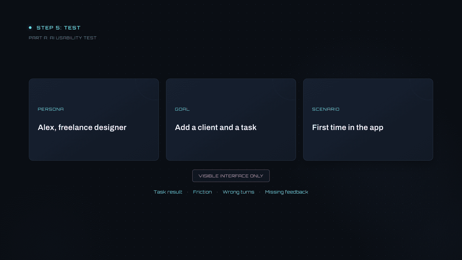
Can someone actually complete the task through the interface? Use an AI agent with interface-interaction capabilities as a simulated user. Give it a persona, a goal, and a situation, then let it discover the steps without telling it where the buttons are.
The agent should use only the visible interface. It should not inspect code, routes, the database, the DOM, or implementation details. This keeps its context closer to what a user can see.
Do not fix the app during the test. Ask it to report task completion, confusion, wrong turns, hard-to-find actions, and missing feedback. Keep its findings grounded in what happened during the test.
Set a realistic persona and task
Adapt this example to your product. Replace Alex, Acme, and the project details with a realistic user and goal. Use a specific date if “Friday” would be ambiguous in your test.
Set the persona and task
✦
Paste into your AI coding tool
You are Alex, a freelance designer managing client projects. You know normal web apps but have never used this product.
Acme needs a homepage revision due Friday. Add Acme as a client, create a website-redesign project, and add a homepage revision task due Friday.
Use only the visible interface. Do not inspect code, routes, database, DOM, or implementation details. Behave like a first-time user.
Run the test
Observe and report the test
✦
Paste into your AI coding tool
Use this product as the persona and scenario provided. Complete the task through the visible interface only.
Notice confusion, wrong turns, hard-to-find actions, unexpected behavior, missing feedback, uncertainty, and blockers. Do not fix anything during the test.
Report task result, friction, wrong turns, unclear UI, and missing feedback. For each important issue: what you tried, what you expected, what happened, severity, and a recommended fix. Report only problems that occurred, not personal design preferences.
Run more than one scenario
Try a new user, a returning user, someone in a rush, someone with a lot of existing data, and someone using a smaller screen. A few different scenarios can reveal repeated problems.
AI simulation can help you test and improve the product before user testing. It does not replace testing with people.
FINAL STEP: PRIORITIZE
Combine findings from the five checks into one list. Prioritize by their effect on the user’s ability to complete important tasks, then review the list before asking AI to implement fixes.
P0: Broken
Users cannot finish an important task.
P1: Major friction
Users can finish, but struggle, get confused, or make repeated mistakes.
P2: Improvement
The experience works but could be meaningfully clearer, easier, or faster.
P3: Polish
Changes have a smaller effect on whether people can use the product.
Include where each issue occurs, why it matters, its recommended fix, and whether it affects one screen or the whole product. A confusing navigation pattern can affect many tasks. After fixing an issue, repeat the task to see whether the change helped.
Prioritize the findings
✦
Paste into your AI coding tool
Combine findings from all five UX checks into one prioritized list.
P0 blocks an important task; P1 creates major confusion or friction; P2 would meaningfully improve ease of use; P3 is polish.
For each item: the problem, where it happens, why it matters, the recommended fix, and whether it affects one screen or the whole product. Put foundational problems before cosmetic ones. Do not prioritize impressive-looking UI by itself.
ONE RULE THROUGHOUT THE AUDIT
Add this instruction whenever AI’s recommendations focus too much on appearance. Each change should solve a user problem or help someone complete an important task.
Keep recommendations focused on usability
✦
Paste into your AI coding tool
Do not confuse good UX with making the UI look more modern or attractive.
Every recommendation must solve a clear user problem, reduce friction, improve clarity, improve accessibility or help users complete an important task.
This DIY workflow helps catch confusing flows, missing states, inconsistencies, and blockers. Professional UX work can go deeper into product strategy, research, information architecture, accessibility, analytics, and validation.
If you’ve built an app with AI and want help improving it, submit your product for a UI and UX review.